

Metalcatto & Lunart
Here we are, back with another list of cover arts that reminds us that the art isn’t only in the music, but also in the artwork we’re hit with first, because we ALL judge an album by its cover—let’s keep it real. Also, as usual, I recruited Lunar, an actual museum curator.
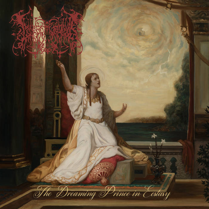
Lamp of Murmuur – The Dreaming Prince in Ecstasy: Speaking of albums that have divided the community, I’d like to start with Lamp of Murmuur, whose artwork is clearly inspired by Neoclassical aesthetics. It draws heavily on the religious imagery of that period, but reframes it through a lens of modern psychological ambiguity. The result is an image that feels ceremonial, intimate, and slightly unsettling at the same time—mysterious in exactly the same way as the music it represents.
6. Abigail Williams – A Void Within Existence
An album with art as troubled and disturbing as its music. This style, so retro and at the same time thematically modern, is hard to leave behind. Lunart acknowledges its quality and craft, but the content itself can be seen as a bit too depressing or even inflammatory for some. To me, I can’t simply forget it, and that’s always a strong plus in my book.
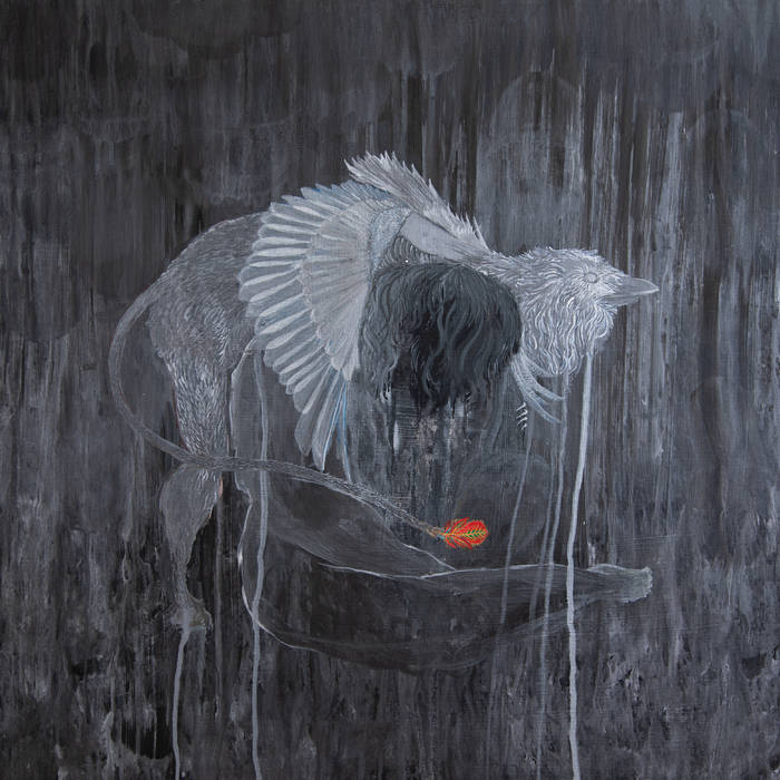
5. Kayo Dot – Every Rock, Every Half-Truth Under Reason
To show you my fairness, I didn’t like this album at all, but the art is nonetheless mesmerizing, disturbing, and sinister, just like the music. In Lunart’s words: “It’s kind of abstract, but if you look closely, you can make out a bird who’s hugging some kind of creature. It looks kind of comforting, but the atmosphere is very dark, which makes the image look very mysterious.”

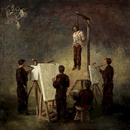
4. Patristic – Catechesis
The moment I saw this album, I knew it meant business. Everything in this cover art exudes quality, but Lunart says it better: “The image is inspired by the ancient Roman Mithras cult. The graphic style refers to early modern Renaissance prints, which I think adds a historical layer to the cover. At the same time, they keep it contemporary by using heavier contrasts in the shadows.” That’s an awesome history trip, don’t you think?

3. Corridoré – Abandon
This might be a wildcard for some of you, but there’s something oddly satisfying about this picture. Yes, the theme is extremely common in Post-Metal, but it bring us a strangely comforting feeling that words can’t describe. “Even though the photo has a grainy texture, it still has depth, which makes it look very poetic in a way.” It makes me feel all sorts of emotions, but mostly, I just want to stare at it for a while.
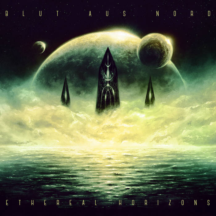
2. Blut aus Nord – Ethereal Horizons
I’ll be honest with you. At first, I wasn’t particularly impressed by this artwork, but some of you and Lunart gave me a different perspective: “This one interesting. The symmetrical composition adds a dramatic effect, in combination with the color scheme, clouds, and light reflections on the water.” It’s the kind of work that gains more details the more you look at it—just like the music on this album.

1. Dormant Ordeal – Tooth and Nail
I don’t think anyone is surprised this is here. The colors, the symmetry—it’s really dark and clean, but at the same time so different from our usual art. “This cover says ancient Greece meets Metal. I like the straight lines in the figures. These lines aren’t reminiscent of ancient Greece, but add nice contemporary accents to a very established image tradition.”
